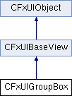
#include <FxUIGroupBox.h>

Additional Inherited Members | |
 Public Types inherited from CFxUIBaseView Public Types inherited from CFxUIBaseView | |
| enum | TextAlignment { AlignLeft = 0x0001, AlignRight = 0x0002, AlignHCenter = 0x0004, AlignJustify = 0x0008, AlignTop = 0x0020, AlignBottom = 0x0040, AlignVCenter = 0x0080, AlignBaseline = 0x0100, AlignCenter = AlignVCenter | AlignHCenter } |
| enum | FocusPolicyType { eNoFocus = 0, eTabFocus = 0x1, eClickFocus = 0x2, eStrongFocus = eTabFocus | eClickFocus | 0x8, eWheelFocus = eStrongFocus | 0x4, eKeyboardOnSetfocus = 0x10 } |
| enum | UIWidthSizePolicy { eXS = 0, eS, eM, eL, eXL } |
 Static Public Member Functions inherited from CFxUIBaseView Static Public Member Functions inherited from CFxUIBaseView | |
| static void | setTabOrder (CFxUIObject *first, CFxUIObject *second) |
 Protected Member Functions inherited from CFxUIObject Protected Member Functions inherited from CFxUIObject | |
| CFxUIObject * | sender () |
 Protected Attributes inherited from CFxUIObject Protected Attributes inherited from CFxUIObject | |
| CFxUIObjectImpl * | m_pImpl |
| CFxUIObjectData * | m_pData |
Detailed Description
Class CFxUIGroupBox provides a frame, a title and a keyboard shortcut, and displays various other widgets inside itself.
Definition at line 27 of file FxUIGroupBox.h.
Constructor & Destructor Documentation
◆ CFxUIGroupBox()
| CFxUIGroupBox::CFxUIGroupBox | ( | ) |
Constructor
◆ ~CFxUIGroupBox()
| CFxUIGroupBox::~CFxUIGroupBox | ( | ) |
Destructor
Member Function Documentation
◆ isCollapsed()
| bool CFxUIGroupBox::isCollapsed | ( | ) | const |
Returns if group box is either collapse or expanded.
- Returns
- bool The value returned is true if group box is in collapsed form, otherwise false.
◆ onCollapsedStateChanged()
| CFxUISignal<void(bool)>& CFxUIGroupBox::onCollapsedStateChanged | ( | ) |
Signal is emitted whenever the state of group box is changed i.e. toggled between collapsed or expanded.
◆ setCollapsed()
| void CFxUIGroupBox::setCollapsed | ( | bool | bCollapsed | ) |
Sets group box either collapse or expanded, depending on the value of passed.
- Parameters
-
bCollapsed If parameter passed is true group box is set to collapsed state, otherwise to expanded form.
◆ setContentsMargins()
| void CFxUIGroupBox::setContentsMargins | ( | int | left, |
| int | top, | ||
| int | right, | ||
| int | bottom | ||
| ) |
Sets content margins in group box.
This property is used when UseMargin() is set to true.
- Parameters
-
left Specifies the left margin for content in group box. top Specifies the left margin for content in group box. right Specifies the left margin for content in group box. bottom Specifies the left margin for content in group box.
◆ setFoldable()
| void CFxUIGroupBox::setFoldable | ( | bool | bFoldable | ) |
This method turns off /on the capability to collapse / expand the group box.
setFoldable( true ): Appearance: Removed icon, text aligned to the left, group box can not be expanded/collapse anymore
setFoldable( false ): Appearance: Showed icon, text aligned to the icon, group box can be expanded / collapsed
◆ setSpacing()
| void CFxUIGroupBox::setSpacing | ( | int | spacing | ) |
Sets the provided spacing between the contents of group box.
- Parameters
-
spacing Input.
◆ setTitle()
| void CFxUIGroupBox::setTitle | ( | const CFxUIString & | str | ) |
Sets the title of group box.
- Parameters
-
str Input
◆ title()
| CFxUIString CFxUIGroupBox::title | ( | ) |
Returns the title of group box.
- Returns
- string , If title is not set, empty string is returned.
The documentation for this class was generated from the following file: